[HD Remake] Sector 6 Slums

  • Thread starter Thread starter Ulpian
  • Start date Start date
Status
Not open for further replies.
U

Ulpian

Guest
Hi there!
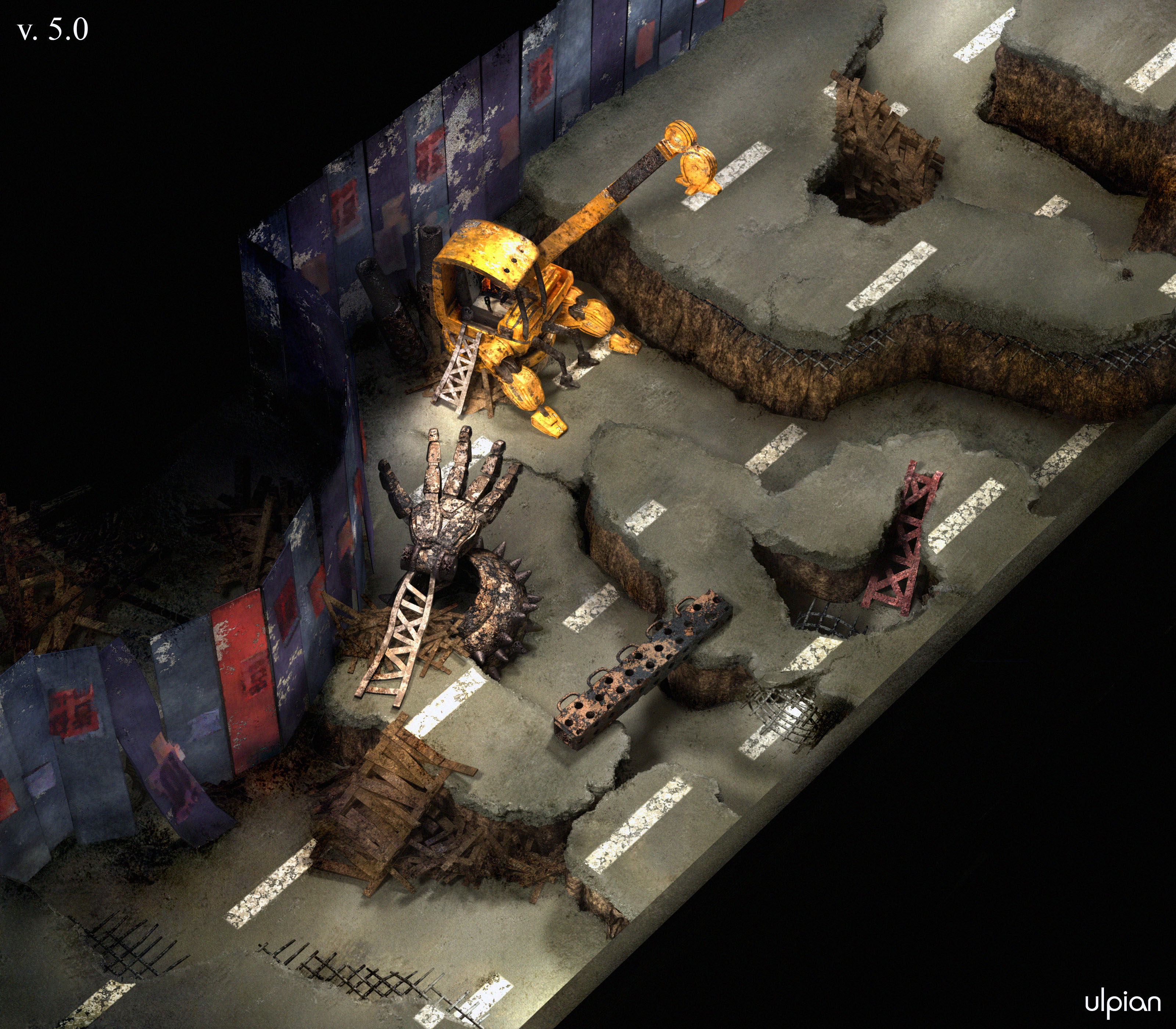
Had a bit of FFVII nostalgia the other day and stumbled upon your brilliant HD overhaul project. I'm not much of an artist, but here's a remake of a Sector 6 field scene I managed to create:

Original
Sector6-ffvii.png


Remake (click for full size)
5cbyuq.jpg]


Looking forward to your comments and recommendations :)

Ulpian

----------------------------------

[EDIT] new versions

11gsgad.jpg


wi3fw2.jpg


a81ug.jpg


Last edited:
I think it looks really good, but I'd like it better if the colors were more saturated, more like the original.
 
I believe it'd look better if you gave it a more "rusty" feeling instead of a "dusty" one. But anyway, nice job!
 
Wow.. Thats really cool.. I didn't really like the original, so good job.

I agree with rayved though colors kinda dull.. Maybe something like this just a suggestion..

editto.jpg
 
Those bumpmaps are a bit strong, and the street is a bit too reflective, but otherwise it's a very good job. A few days, you say? That pretty much makes you faster than most of TA.
 
That looks nice. I second the points about the bump/normal maps on the road and the higher saturation. Also, is it just me or does the render look a little noisy? What 3D app was this modelled and rendered in? For someone who says they're not much of an artist you did a pretty good job!
 
I really like it.
IMO the saturation should be something between yours and whitERaven. Also the road seems to have too much "gravel" (?), i mean it almost looks like earth dirt.

Anyways, i like your style, do you think you'll be doing more scenes?
I really hope so :)
 
Thanks for the feedback guys, it's been quite helpful so far :)
As per your recommendations, here's version 2.0 with less bumpy/reflective roads and more saturated colors overall:

11gsgad.jpg


(Apps used are Maya/mental-ray + Photoshop)

Ulpian
 
Last edited:
The white lanes should be more worn off line in the original too. It looks too bright and clean. As for the corrections you made, I think the colors look great!
 
That's great stuff, ulpian! Keep it up!
I would have some recommendations:
- Eventually you may have to aim for a high-res render which is 5x5 times the size of the original. This would make this particular picture extremely large (something like 3200*2800) and rendering times may become a bit of a problem. I think TA set a minimum at 4*4 times, which still makes it 2560*2240.
- The reason why I mention the target high-res is because many details will require improvements when you get to that scale, while they are not apparent even at half such render size (I know that from my own slow progress  :oops:).
- I think that the textures of the road need further revisions. 2 aspects come to mind: first, the surface bumps of the road are, in my opinion, the sort of things which should not show up until you really get to the very high-res renders I mentioned before. At your current scale, they should be barely visible. Then, I would advise you model the thickness of the road with another texture, which may be similar to the surface only with much more pronounced bumps (your current bump size may do). For reference, check out pictures of broken roads (like after landslides or earthquakes), with an example below.
Broken-Road.jpg

Otherwise, most of your stuff looks spot-on. Looking forward to seeing more  :)

EDIT: Got you listed on the sticky Tasklist.
 
Last edited:
the light above the bottom entrance is too bright, causing a high level of plastic-y spec reflection on the ground. Other than that very nice, try to make the colors pop out a bit more, and vary up the posters on the wall.

Welcome to Qhimm.
 
Hi all, thanks again for your pointers and kind words, much appreciated :)

-   Fixed lanes and bottom entrance’s light, as per Rayved’s and Timu’s comments
-   Following Mayo Master’s considerations on high-res rendering, refined and reduced bump map everywhere and tweaked textures overall so that they look somehow decent up close; accordingly did a render at 300% of the original background size rather than 200%
-   Touched up a few textures in post-processing

(click for 1920x1680 resolution in all its glory)
wi3fw2.jpg


By the way, I’m not sure I understand the point of a potential 5x5 render: isn’t the native FFVII resolution 320x240? 500% resizing only makes sense when playing in a 1600x1400 window, which seems quite a lot. A mere 300% resizing of every field screen background lets one already play at '720p' quality, if I’m not mistaken.
 
In my opinion you could reduce the bumps of the road surface some more. The original looks pretty slick.
As for the 5 x 5 size, well, full HD means 1920 x 1080, while most screens of the original are indeed at 320 x 240. So technically, to satisfy HD requirement we would need a 4.5 magnification, which we "rounded" to the upper value. Or at least, that's how I understand things.
The image you are working on is a field scene where the screen "scrolls" as you move the character, so I would suppose that you need to get the image beyond the resolution of just one single screen. Perhaps someone else can confirm you this.
 
Last edited:
Awesome scene. Only thing popping out to me is the overall environment light is way darker then in the original. I like it though, maybe make the walls slightly more visible.
 
Nicely done. 5x renders has mostly to do with keeping an even pixel (.5 scaling artifacts are nasty), and as was stated above, scrolling scenes have use playing fairly zoomed in. Congratulations on the good work, I look forward to seeing more of your art.
 
Latest changes, hopefully this qualifies as the final version :)

-   Reduced bump map on the road again (though I do find the original one slightly too smooth)
-   Environment lighting overall brighter
-   Lots of post-processing adjustments

a81ug.jpg


Here’s the original again for good measure

Sector6-ffvii.png


And here's how an in-game screenshot would appear:

(click to zoom)
4raidc.jpg


vs.

ayrjhu.jpg


Cheers,

Ulpian
 
I feel that it looks to clean. Not enough cracks in the asphalt and not enough dirt on it as well.

Otherwise, it looks great! i'd love it use it either way
 
Status
Not open for further replies.
Back
Top